
Chameleon Magazine
A response to the micro-trend of "feminist luxury" as a university brief. An intersectional feminist-minded fashion magazine called Chameleon.
Note - The fashion images used are not mine, neither are the articles.
This project was a response to a university brief - I was tasked with researching the current micro-trend of “feminist luxury”. This essentially refers to the recent efforts to “glamorize” the feminist movement and make it more attractive. This trend was particularly obvious in the fashion world in 2014, where all of a sudden, women’s rights were supposedly being championed by fashion designers with questionable morals, such as Karl Lagerfeld in his F/W14 fashion show.
As a feminist I had mixed feelings about this trend, as while I completely support increased engagement with the gender equality, I felt that the fashion industry saw it as a trend they could capitalize on, and discard when it was out of season. The one benefit I saw was that it gave fashion-lovers a place in the feminist discussion, where they may have previously been left out or even mocked, as fashion is often seen as superficial, though it is perfectly valid as an interest and artform.
Because of this, I wanted to create a solid platform for those interested in fashion to engage with issues surrounding gender, as well as other equality causes in the context of the fashion industry. The result was a magazine called Chameleon which would talk about fashion in a deeper context and focus on positive and negative figures and trends within the industry.
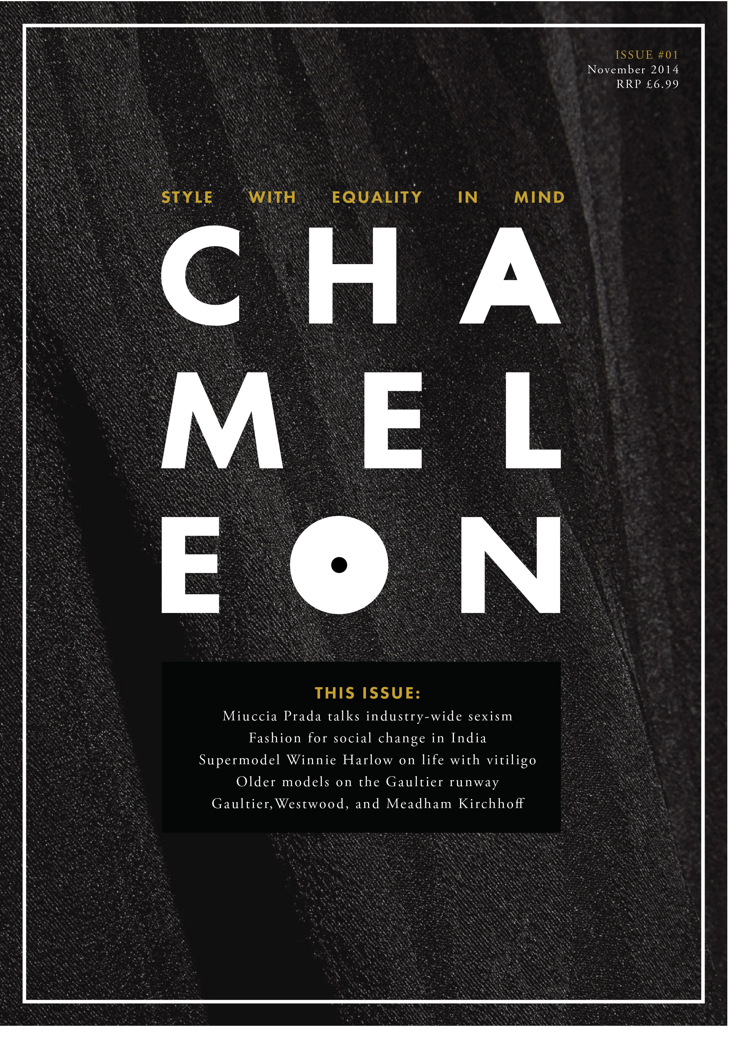
Cover page.
Chameleon magazine looks nothing like any other fashion magazine, as it deals with very different subject matter - it engages with issues, rather than fleeting and superficial trends. The cover design would feature a close-up visual of a fashion piece featured in the issue, highlighting the craftsmanship behind it. While virtually every other fashion magazine sticks to a standard format of having one or more people - generally women - on the cover surrounded by masses of busy text, Chameleon would have a comparatively anonymous, minimal front cover. This example edition features a close-up section of a Vivienne Westwood piece.
In many ways it could be seen as an “anti-fashion fashion magazine”, and its design would reflect a more assertive sentiment. Every edition would feature the "Chameleon Manifesto" on the first page. The manifesto is designed to resemble a ransom note. The majority of the words would be snippets of headlines from other fashion magazines, but certain words, such as would be handwritten, as they are not the sort of topics other style periodicals address - showing just how different Chameleon would be in terms of its core values.
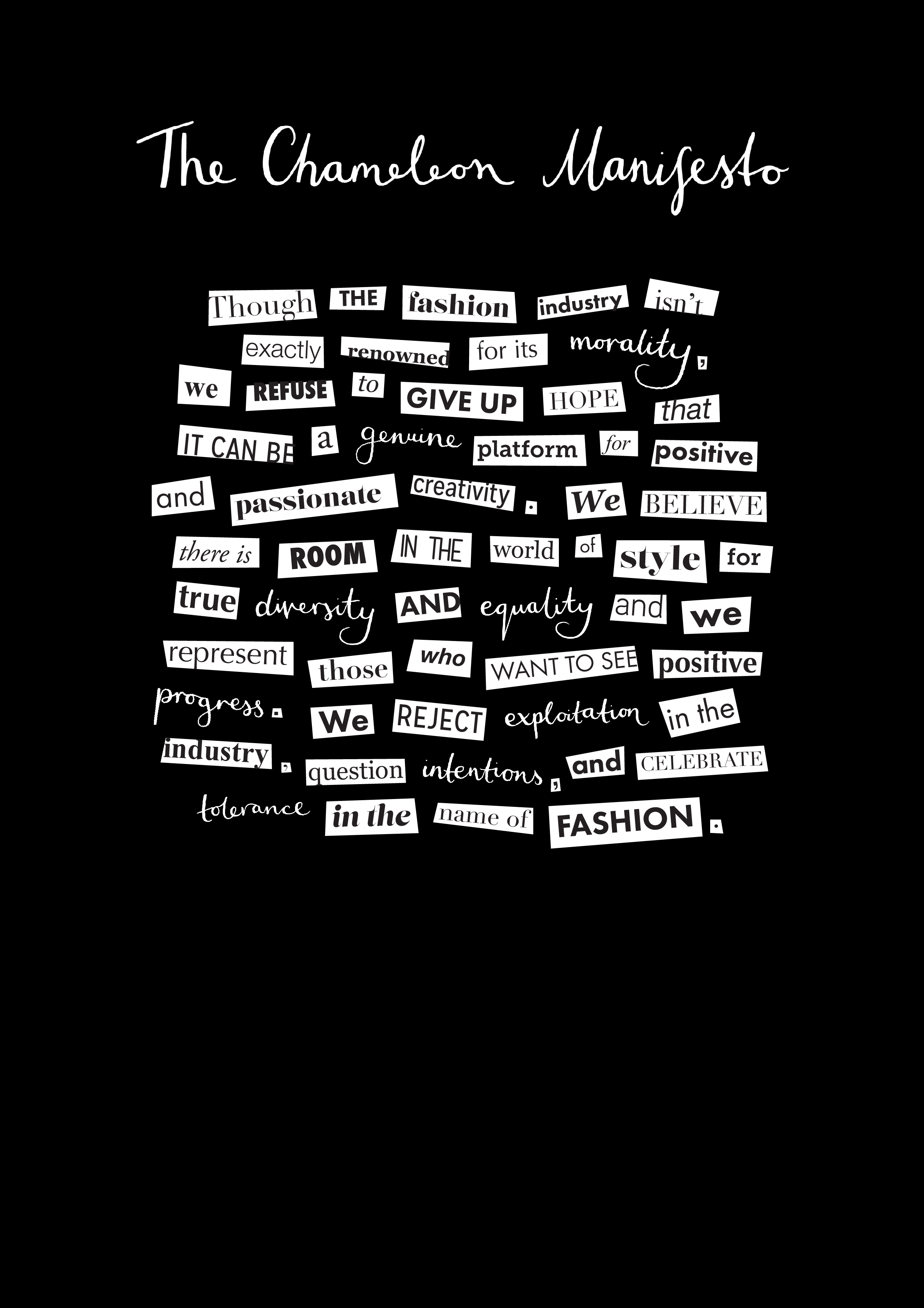
The Chameleon Manifesto.
Chameleon would feature articles about influential figures in the fashion industry inciting positive change across a variety of frontiers. Inclusivity would be one of the magazine’s core brand values, and so issues and progress related to sexuality, transgender rights, body type, disability and race would be addressed. Problematic areas and figures within the industry would be brought to attention and critiqued, while positive figures and changemakers would be celebrated.
I chose to use existing articles from other publications to feature in my proposed design for Chameleon. This interview with Laverne Cox (originally by Instyle) was exactly what I was looking for as it addresses her relationship with fashion in terms of her own personal experience with both race and being transgender - positive and negative.
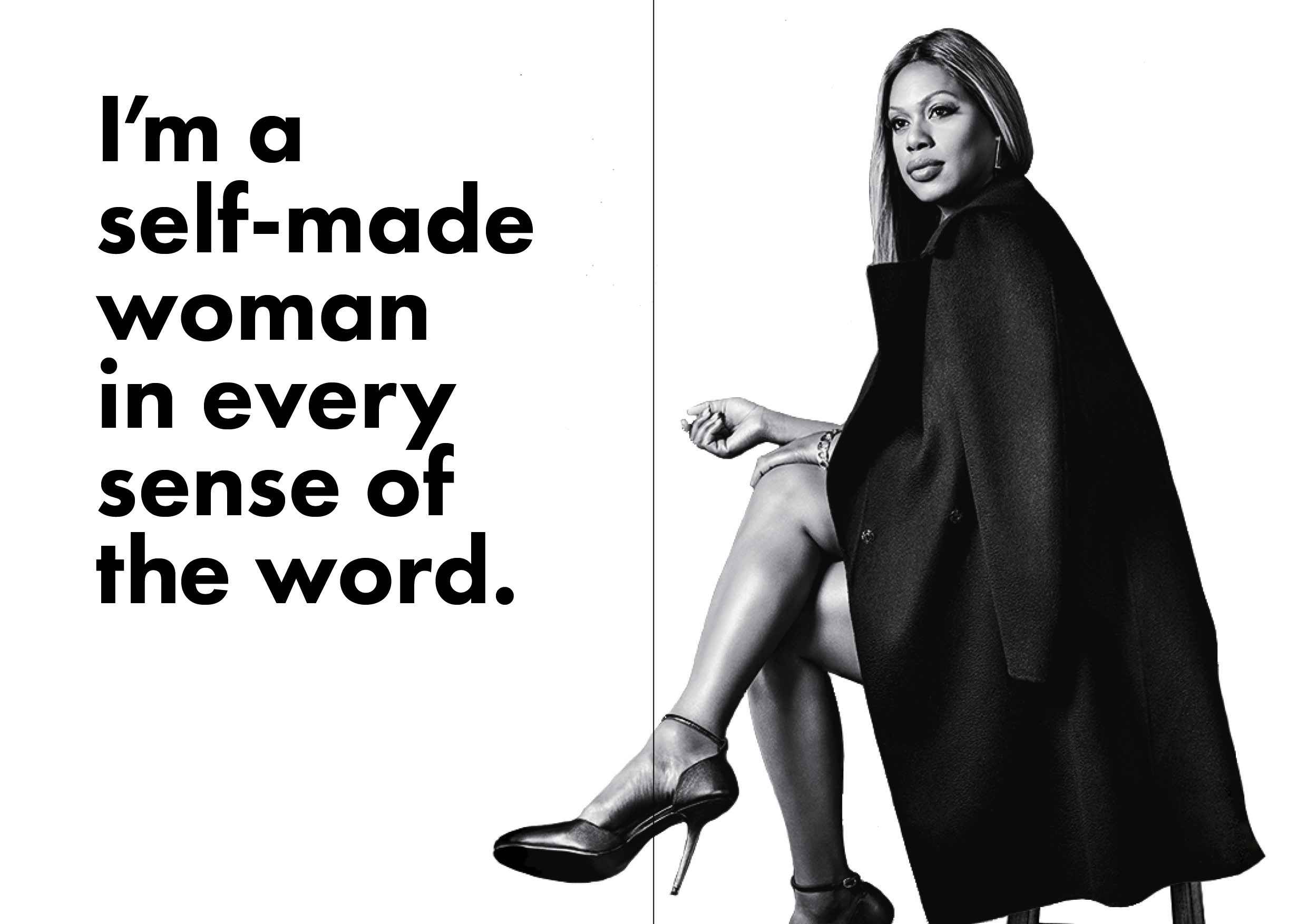
Laverne Cox introductory spread.
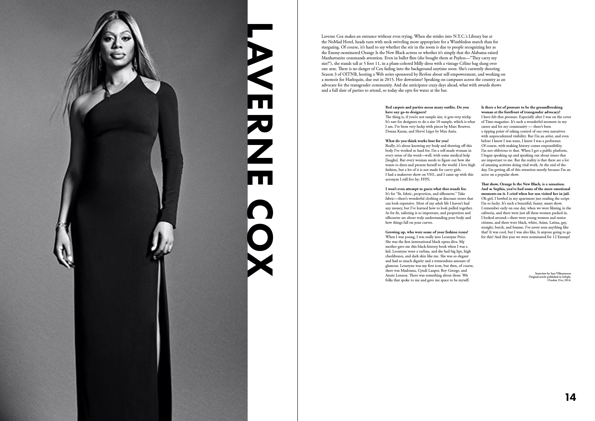
Laverne Cox interview spread.
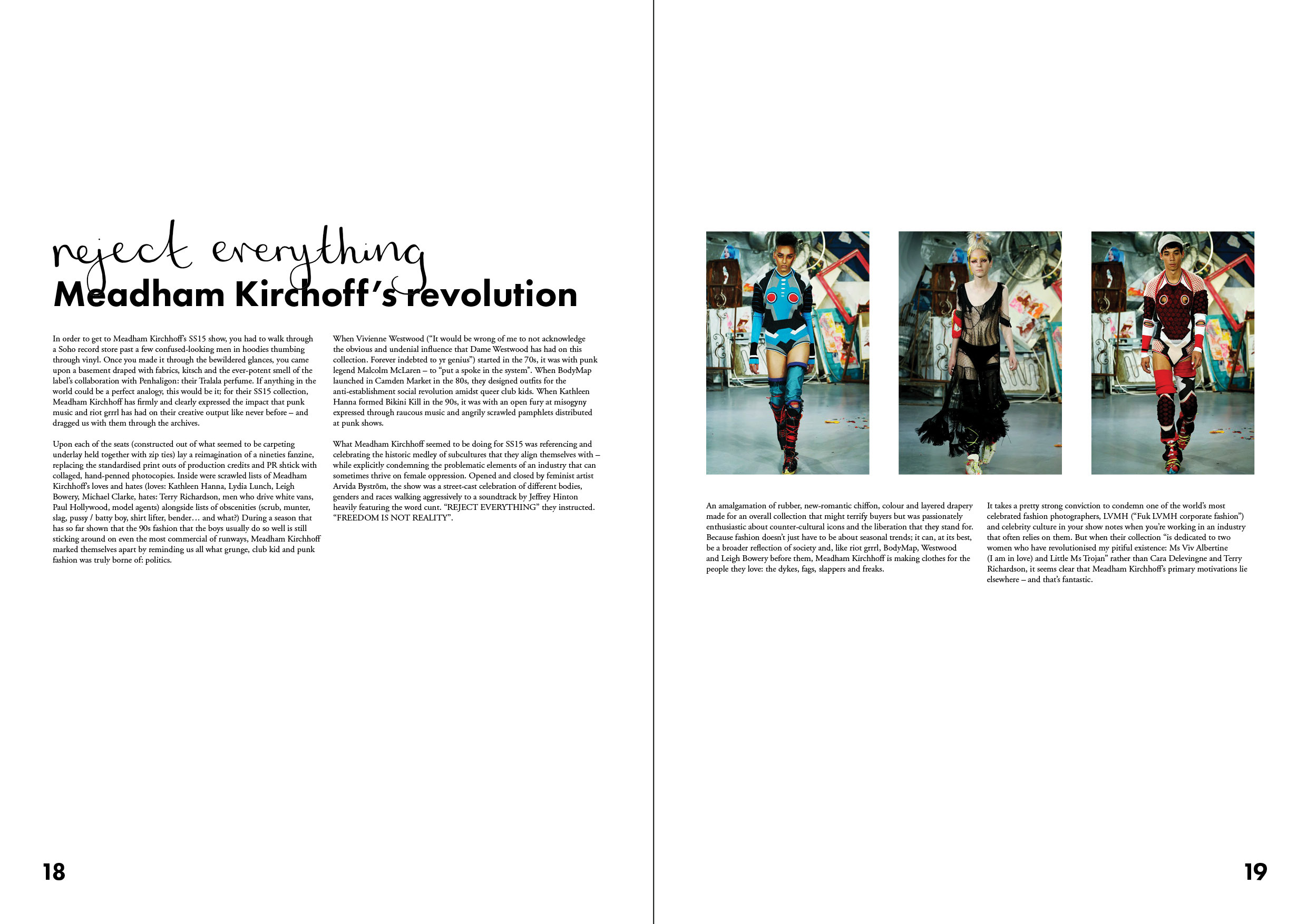
Meadham Kirchoff article - original source here.
In terms of the design of the magazine itself, my aim was to make it reflect just how different it was from other mainstream fashion magazines in content as well as in style. It is a rejection of their design clichés, and so Chameleon would be comparatively minimalist in terms of style, focusing on high quality writing and images.
Colour use would be restrained compared to most fashion magazines, and the colour palette would change per edition inkeeping with the cover imagery. Typefaces would also be limited, mainly sticking to Futura and Garamond, with handtype for more playful layouts.
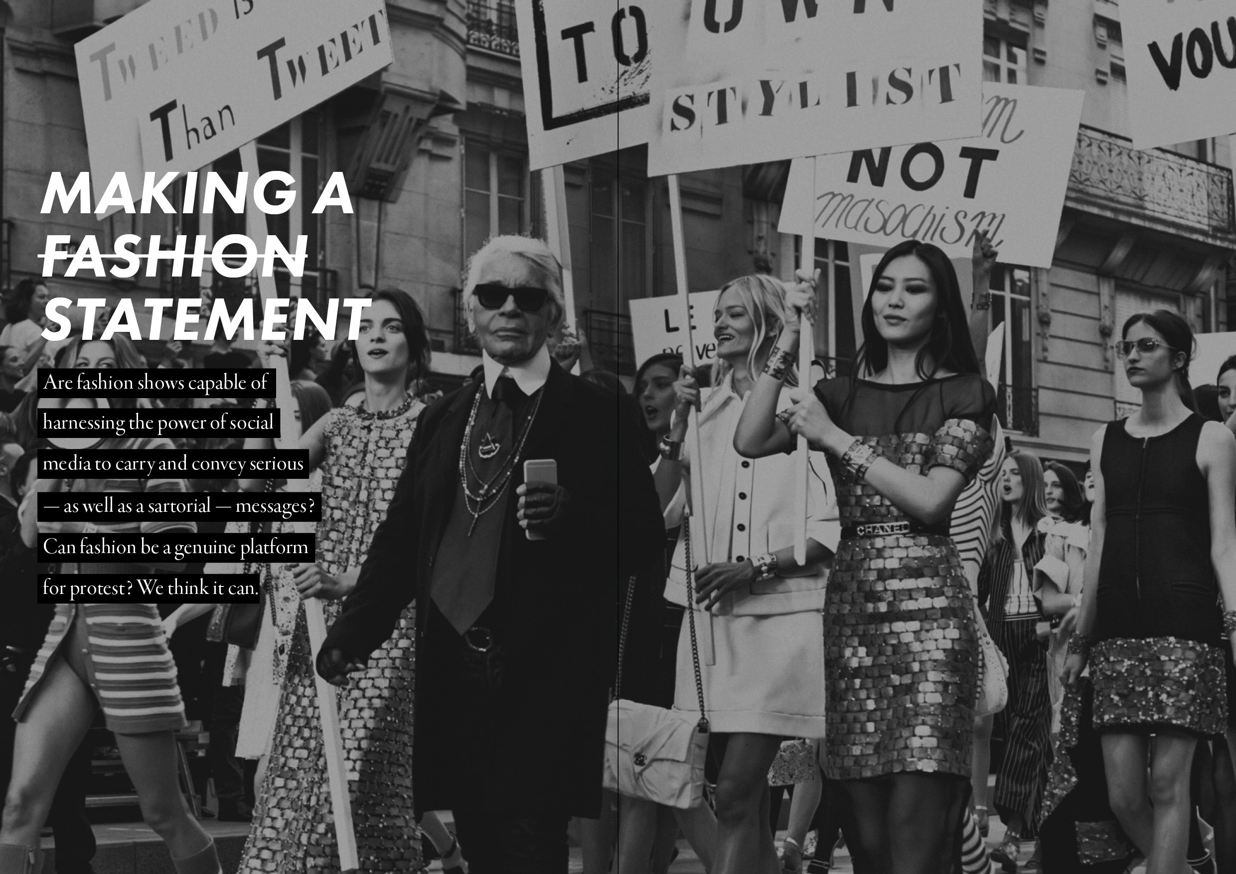
Opinion piece introductory spread.
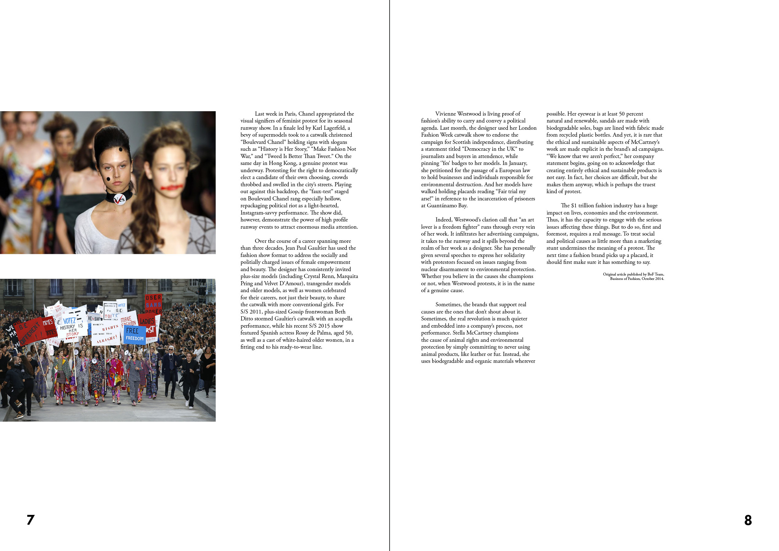
Opinion piece on "protest fashion" - original source here.